Mohawk Paper Superfine Folding Board
Eye-catching and appealing promotional materials for Mohawk Paper’s new line of Superfine folding board engineered for packaging.
CLIENT BACKGROUND
Mohawk Paper engineered a new folding board, translating their famous Superfine formula for packaging! These new board papers provide a superior print surface of inks, foils, embossing, and other embellishments, so it was important for promotional materials to display these features. Mohawk Paper was seeking a promotional booklet containing packaging samples of two different colors and 4 different weights. They also required photos of the printed materials to promote the new line of folding boards.
PROJECT GOALS
Develop printed promotional materials to communicate and display the folding boards’ features.
Conceptualize a theme and story for these promotional materials.
Photograph the final pieces in a graphic, eye-catching way to promote the new line of folding boards on the Mohawk website and social media.
SERVICES PROVIDED
Print Design
Photography
DELIVERABLES
Print Booklet
Packaging Samples
Photography and Gifs of Materials for Promotional Purposes
Booklet and Packaging Samples
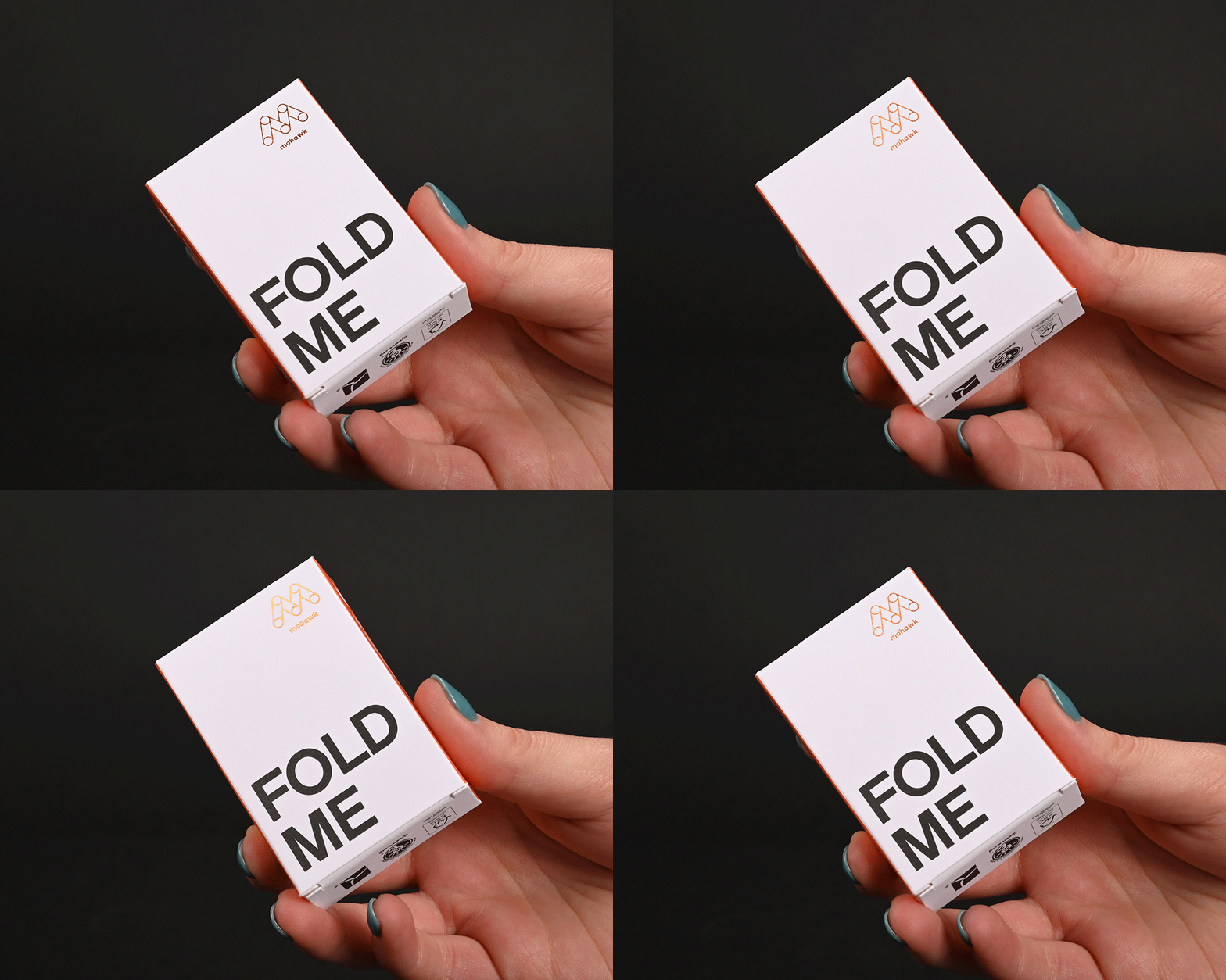
We were tasked with developing a concept to communicate how versatile Mohawk’s Folding Board is. During ideation, we wanted to create something that would entice the viewer to hold and feel the tactile quality of the board and the embellishments. We felt it was important to create a similar attention-grabbing title for the piece that followed a similar formula to other Mohawk swatch books and promotional materials (The Material is the Message, Make a Memory, Paper with a Plan, etc.) We came up with “Made to Fold.” Communicating that Mohawk’s new Folding board was engineered specifically for packaging. We also communicated the packaging’s functionality through lines, dashed lines, and arrows, commonly used on dielines when designing packaging. We pushed “Made to Fold” even further, reinforcing the concept through the packaging samples. The samples are originally flat in the booklet, so each sample displays a commanding “Fold Me” to convince the viewer to make the sample 3D, experience the flooding perfection, feel the board, and experience the embellishments first-hand.
Promotional Photography
Mohawk promotes all of its products and promotional materials on its website and social media, so we were tasked with providing photos of the final booklet and packaging samples. To keep the focus on these items, we worked with a minimal, black, infinite background (shot on Mohawk Mosaic Onyx Vellum). This complimented the bold typography and helped the bright colors, patterns, and specialized print techniques, such as foil and blind embossing, to stand out.
In addition to the still photographs you’ve already seen, we created gifs showing a packaging sample being held to catch the light and showcase the foil stamp, as well as being folded.
See more about Mohawk Paper’s folding board on their website!


